The History of the Euro’s Design: No National Bias
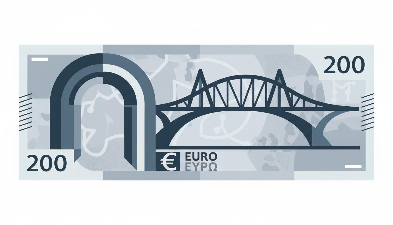
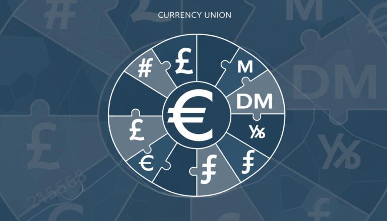
When the European Union embarked on creating a single currency, it faced a challenge that was as much cultural as it was economic: how do you design money that represents dozens of diverse nations without favoring any single one? The fascinating euro banknote design history is a story of deliberate political neutrality, a masterclass in creating a unified symbol from a mosaic of distinct identities.
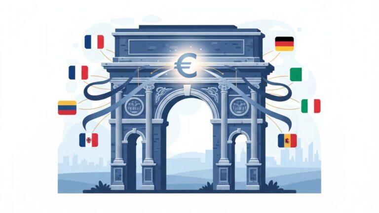
The solution was to avoid specifics entirely. Instead of featuring national heroes, famous landmarks, or historical events, the euro’s designers chose a theme of shared heritage. The result is a currency built on imaginary architecture—bridges that connect no specific shores and windows that open onto no particular city—all to foster a sense of pan-European identity.
The Foundation of Neutrality in Euro Banknote Design History
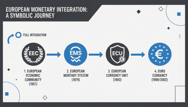
The journey to the euro’s final design began in the early 1990s, long before its 2002 debut. The European Monetary Institute (EMI), the precursor to the European Central Bank (ECB), knew that the currency’s appearance was critical for its acceptance by the public.
The primary goal was to create a visually coherent currency that was politically neutral and reflected a common European heritage. Early on, a list of potential themes was considered, but many were quickly discarded. For example, depicting famous figures like Napoleon or celebrated artists was ruled out to avoid any perception of national bias.
Choosing ‘Ages and Styles of Europe’
Ultimately, the governing council selected the theme ‘Ages and Styles of Europe.’ This concept brilliantly sidestepped national rivalries by focusing on architectural motifs from different periods of European history. Each banknote denomination represents a different era, from Classical to Modern architecture, but without depicting any actual, existing structures.
This approach ensured that the designs were relatable to all Europeans as part of a shared history, without being specific to any single member state. This foundational decision was a direct outcome of the political unity envisioned by agreements like the Maastricht Treaty, which laid the groundwork for the single currency.
Strict Euro Design Criteria: More Than Just Aesthetics
To bring the ‘Ages and Styles’ theme to life, the EMI established a set of rigorous euro design criteria. These rules governed not just the look of the notes but also their functionality, security, and inclusivity. A Europe-wide competition was held, and the winning designs by Austrian artist Robert Kalina were selected in 1996 and approved by the ECB Council in 1996.
No National Bias: The Golden Rule
The most fundamental requirement was absolute political neutrality. This principle of no national bias euro notes dictated that no real monuments, artistic works, or people could be featured. Every element had to be a stylized representation.
- Windows and Doorways: The front (obverse) of each banknote shows windows or doorways, symbolizing the European spirit of openness and cooperation.
- Bridges: The back (reverse) features a bridge, symbolizing communication and connection among the people of Europe and between Europe and the rest of the world.
- Imaginary Structures: Critically, all these architectural elements are fictional illustrations. They are designed in the style of their respective eras but are not based on any specific, real-world structures.
Inclusiveness and Accessibility
The designs also had to be inclusive and accessible to everyone. The banknotes vary in size and use bold, contrasting colors to make them easily distinguishable, particularly for the visually impaired.
Tactile features, like raised print, were also incorporated. The map of Europe depicted on the notes was updated in the second series, the ‘Europa series,’ to include Cyprus and Malta, which had been omitted from the first series due to scale.
Advanced Security to Build Trust
To deter counterfeiting and foster public confidence, the banknotes were embedded with state-of-the-art security features. The ECB’s goal was to make the euro one of the most secure currencies in the world. Key features include:
- Watermarks: A faint image visible when held up to the light.
- Holograms: A shimmering strip or patch that changes image when tilted.
- Raised Print: The ink feels thicker in some parts of the banknote.
- Color-Shifting Ink: The numeral on the back changes color when tilted.
Symbolic Architecture: The Story of the Bridges on Euro Banknotes
The bridges on euro banknotes are perhaps the most powerful symbols of the currency’s philosophy. Each bridge is rendered in a distinct architectural style, corresponding to a period in European history.
Here’s how the styles align with the denominations in the first series:
- €5: Classical
- €10: Romanesque
- €20: Gothic
- €50: Renaissance
- €100: Baroque and Rococo
- €200: 19th-century iron and glass architecture
- €500: 20th-century modern architecture
By using these generic yet recognizable styles, the designs create a visual timeline of shared European progress and innovation. You can explore these design elements in detail on the official European Central Bank website.
A Deliberate Contrast: The Euro Coinage Design History
The philosophy behind the euro coinage design history provides a stark contrast that highlights the intentional neutrality of the banknotes. While the paper money is strictly pan-European, the coins have two distinct sides.
One side is the ‘common European side,’ which is the same for all euro area countries and displays the coin’s value. The other side is the ‘national side,’ where each member state is free to feature its own symbols, such as monarchs, national landmarks, or historical figures. This hybrid approach allowed nations to retain a piece of their identity while participating in the monetary union, reserving the powerful symbolism of complete neutrality for the higher-value banknotes.
Updates and Redesigns: The Europa Series
To stay ahead of counterfeiters and reflect changes in the EU, the ECB began releasing a second series of banknotes between 2013 and 2019. Known as the ‘Europa series,’ these notes were led by designer Reinhold Gerstetter and introduced several key updates.
The core theme of ‘Ages and Styles’ and the principle of no national bias remained untouched. However, the security features were significantly enhanced. The new notes feature a portrait of Europa, a figure from Greek mythology, in the watermark and hologram, adding another layer of shared, classical heritage. The map was also updated to include new EU member states, reinforcing the currency’s role as a symbol for an expanding union.
Frequently Asked Questions
Why are the bridges on euro banknotes imaginary?
The bridges are stylized and not based on real structures to prevent any perception of national bias or favoritism among member states. This ensures the currency represents all of Europe collectively rather than any single nation.
What security features are included in euro banknotes?
Euro banknotes incorporate advanced security features like holograms, watermarks, raised printing, security threads, and color-shifting inks to prevent forgery and build public trust.
Who designed the original euro banknotes?
Austrian artist Robert Kalina designed the first series of euro banknotes, which were issued in 2002. Reinhold Gerstetter, a German designer, led the redesign for the second ‘Europa series.’
Are any historical figures depicted on euro banknotes?
No. To maintain strict political neutrality, no real people, national heroes, or specific monuments are depicted. The designs focus entirely on generic architectural styles that symbolize European heritage.
How are euro banknotes and euro coins different in their design approach?
Banknotes use only neutral, pan-European motifs with no national references. In contrast, coins have a common European side and a unique national side where each country can display its own imagery.
A Currency Designed for Unity
The design history of the euro banknote is a testament to a unique political and cultural project. By deliberately avoiding national symbols and embracing shared architectural styles, the euro was crafted to be a currency for all Europeans. The iconic imaginary bridges and windows serve as a daily reminder of the project’s core values: openness, connection, and cooperation.
This careful and methodical approach to design was essential for the currency’s acceptance and success. To learn more about the broader context of this monumental undertaking, explore our detailed guide on the creation of the euro.